February
This month was a lot. Lucky I was afforded a leap day that fell on a saturday and I could make a mad dash to finish this project up.
I honestly didn't put too much effort into this specific challenge. Most of the month I spent setting up this website on an 11ty build which had a lot of technical problems I had to work out. But in the end, I love how this site came out and its completely removed from my personal site.
As far as the design for this months challenge, I decided to eliminate the video section and fill it in with the color block instead. The original designer of this seemed to think videos are normally taller rather than wider in proportion and thats not a problem I want to solve. I think this final output is a lot easier to digest and I like the large use of color.
A lot of the work on this one seemed to focus on the carousels again. I basically brought over a lot of the javascript I wrote from January and dropped it here. To further that code though, I have the carousel encorporating the trip images as well descriptions. Each functions as it's own section of the HTML, I just hooked into the container for each within the javascript.
Also, instead of using flexbox and hiding elements that overflow past the parent container, I decided to use some opacity animations and toggle between display: none and display: block or display: flex.
It functions in the same way but has a nice little fade in rather than a slide.
Thoughts going forward
I'm not that happy with how unresponsive my grid builds have been. I plan on coming back to this month and last to rebuild the responsiveness of it, but I have a few ideas I'd like to test out going forward. Mainly, I think I want to build a grid that isn't build to the original mock up. My thought is that it would work the same way as a bootstrap grid where the container has auto margins and is a max width. I'm currently creating grid rows and columns that are given sizes and letting the elements fall into the necessary area. Going forward, I'm going to try defining element grid spans and either let the source order define placement, or manipulate order placement along with grid density.
I don't think this will be a perfect solution, but I think it may be more flexible in defining a page as a whole. I can then incorporate my original ideas from projects like this to get better responsive layouts.
Ideas
I think I'm going to try and revisit other projects each month or try to have some "side quests" to get done each month. I want to try and expand on this 11ty build as well as port of my personal site. I'd also like to just declutter my personal site by porting off different projects there to different 11ty builds and hooking into them as subdomains on netlify.
Photo Credits
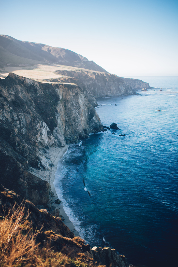
Photo by Ian Schneider on Unsplash
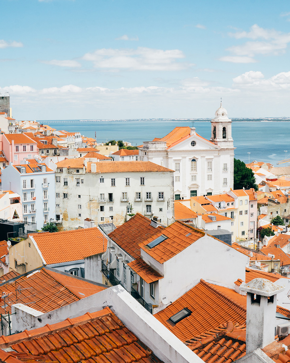
Photo by Robin Benzrihem on Unsplash
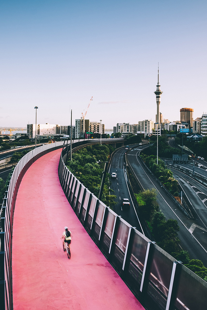
Photo by Tom Byrom on Unsplash
Photo by bantersnaps on Unsplash
Photo by Dan Freeman on Unsplash
You're drunk. Go Home